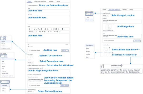
How to build box blocks
Blue box block
Lorem ipsum dolor sit amet
Box Colour: Blue
Icon: PDF file
Bottom Spacing: Standard
Read time
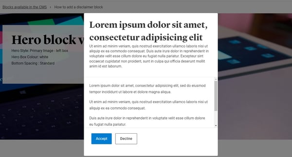
Box block with modal
Box Colour: Lighest Grey
To add a teaser tag:
In the box component, got the the Metadata tab and select it form the 'Visible teaser tag' selector

Box block with image
Lorem ipsum dolor sit amet
Duis aute irure dolor in reprehenderit in voluptate velit esse cillum dolore eu fugiat nulla pariatur.
Box block
Lorem ipsum dolor sit amet
Ut enim ad minim veniam, quis nostrud exercitation ullamco laboris nisi ut aliquip ex ea commodo consequat.
Box block with telephone availability block
With Telephone availability block
Box block with image and buttons
Add subtitle
Add text
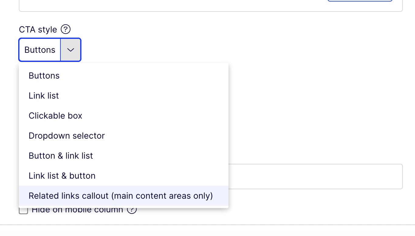
Box with CTA style selected as dropdown
Box with CTA style selected as links list
How to create Related links
Related links can be created by using Box Block
for CTA style use the option "Related links callout (main content area only)"
and can only be created if Box Block is being used in the main conatent area.
For the Related links, subtitle or the body for the box block will not be shown on the page.
If the "Related links callout (main content area only)" CTA style option is being used in the Box block, however, the Box block is part of a Grid block then on the page the CTA style will be rendered as link.
Below are the examples:

Box block Related links
CTA type as Related link, however, as the Box block is not used in the main contet area, it will be displayed as Link list and should NOT be shown as Related links.