Call to action styles
How to change / update the CTA's style
The way that the CTA's will be shown can be set using the associated droplist, called CTA style.
This allows the choice of the style of CTA shown:
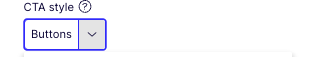
Each style has a particular way of showing the CTAs (examples on the blocks below):
- Buttons - will show up to the first 2 CTAs as buttons (additional CTAs will be ignored);
- Link list - will show unlimited CTAs as a styled link list;
- Clickable box - will allow the whole box to act as a link to the first CTA configured (additional CTAs will be ignored) - includes a rollover effect for the box and image;
- Dropdown selector - will add all link titles in a dropdown selector with a continue button;
- Button & link list - will show a combination with the 1st CTA being displayed as a Button and the rest as Link list;
- Link list & button - will show a combination with all but the last CTA being displayed as a Link list and the last as a Button;
- Related links callout (main content areas only) - If the box is in any other content area (grid for example), the box will look like a standard box with a link list.

Modals and inline blocks
Modals and inline blocks
Buttons
Below is an example of the Button styles available:
Primary and Secondary.
Buttons
Below is an example of the Button styles available:
Primary Green & Secondary.